WebEdge UI design system
Shared components so internal and client interfaces do not feel like separate products.
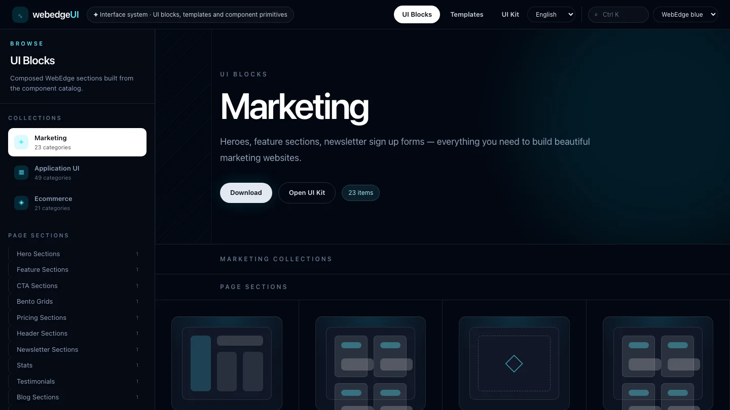 Dev-story
Challenge
Several projects used similar controls, but colors, spacing and states started to drift.
What we did
We consolidated Vue, Tailwind and headless components into a shared UI layer with reusable patterns.
Result
New interfaces start faster while keeping the same visual and accessibility logic.
Dev-story article
WebEdge UI design system: how the project was built
Several WebEdge interfaces needed the same controls, but colors, spacing, empty states and interaction details were starting to drift. The design system turns those repeated pieces into a shared UI layer.
Sections
06
Modules
04
Stack
Vue 3 + Tailwind
Why the project exists
Several projects used similar controls, but colors, spacing and states started to drift.
Several WebEdge interfaces needed the same controls, but colors, spacing, empty states and interaction details were starting to drift. The design system turns those repeated pieces into a shared UI layer.
What was built
We consolidated Vue, Tailwind and headless components into a shared UI layer with reusable patterns.
The design system groups Vue 3 components, Tailwind tokens and Reka UI primitives into reusable patterns for internal tools and client interfaces. It covers the controls teams use most often before they become copied one-offs.
Main modules and user path
Form controls, dialogs, menus and navigation pieces provide shared behavior for flows such as editing records, filtering lists and confirming actions.
Design tokens define spacing, color, radius, focus states and dark-mode behavior, so screens can look related without every app copying CSS by hand.
Component examples document loading, disabled, empty, validation and selected states, helping product screens handle real data conditions.
Accessibility patterns from headless primitives are wrapped into app-ready components, reducing different keyboard and focus implementations.
Architecture and technology decisions
Technical foundation: Vue 3, Tailwind, Reka UI. This matters not as a logo list, but as the set of choices that keeps data, state, user actions and future maintenance manageable.
Vue, Tailwind and Reka UI fit the existing WebEdge stack. Shared interface behavior stays separate from business-specific screens.
How it works in a real scenario
In real use, “WebEdge UI design system” works as a clear sequence: it starts from the original problem, then the user takes the primary action, follows a clear data path and reaches the result. The experience stays logical instead of being a random set of screens.
The practical value shows where manual work used to be needed: part of the process is automated, responsibilities are clearly separated, and each module does one understandable job. That is what keeps the solution easy to maintain and extend.
Result and lessons
New interfaces start faster while keeping the same visual and accessibility logic.
New products can start with a common interaction vocabulary. Teams spend less time recreating controls and more time building records, workflows and reports.
Related articles
Read next
Related project stories
These projects share nearby technical or product decisions, so they show how the same principle behaves in another context.
 Dev-story
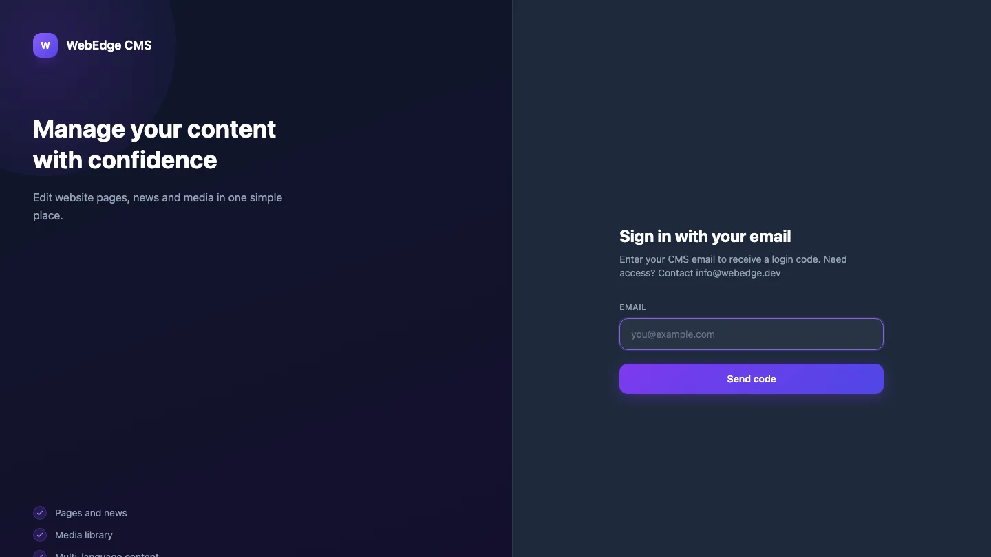
WebEdge CMS and public content API
Content management that feeds websites and lets the team publish without developer intervention.
WebEdge project
AI agent control plane
AI agent control plane
An internal workspace for agent jobs, instructions and run status.
WebEdge project
Calendar booking platform
Calendar booking platform
Time booking, team schedules and notifications in one interface.
Have a similar idea?
Discuss your project